Saturday, January 3, 2009

January 3, 2009

Do Not Burn Near Combustibles.
Those are the words embossed on the votive candles at San Fernando Cathedral.

Repetition is a design term, and refers to the use of an element more than once in a composition. Including an element multiple times in a picture serves several purposes. 

The artist's intent could be to generate balance among design elements. The use of repetition could also be a visual clue from the artist, indicating the importance of an element to the composition's story line. Grouping like elements sends a message that is quite different from the use of an element all by itself, at least partly because sheer numbers generate a visual impact more powerful than the use of a single element. Imagine how different this picture would be if only one candle glowed in the dark. Perhaps then it would read visually as a beacon. Or a single prayer or wish. 

The use of repetition in this picture supports a different message. It suggests hundreds of prayers being offered simultaneously. Each one unique and important, but each made more powerful as part of the collective offering. 
4 comments:

Jackie said...

"Hundreds of prayers offered simultaneously"--a wonderful thought and reminiscent of a temple in Kyoto, Japan. Sanjusangendo has 1001 statues of a Buddhist diety, the Kannon. All are unique, though similar, but the sense of holiness is similar to all of your candles. Thank you for reminding me of that experience and of all the prayers being offered besides mine.

Clairan Ferrono said...

I find this image simultaneously beautiful and hilarious. The irony of the repeated words.

MaryA said...

This picture and words reminded me of another Japanese link, this one at Myoshiji in Kyoto. I was feeling reluctant to offer my individual prayer, until my friend reminded me of the power of group prayer.
Also, repitition can be interpreted as "I meant to do that."

Mary

EmPrint said...

Thank you for the reminder of ....hundreds of prayers offered simultaneously.
And ....more powerful as part of a collective offering.

I need to be reminded that my world is filled with a collection of known and unknown support.

November 20, 2008

November 20, 2008

November 20, 2008

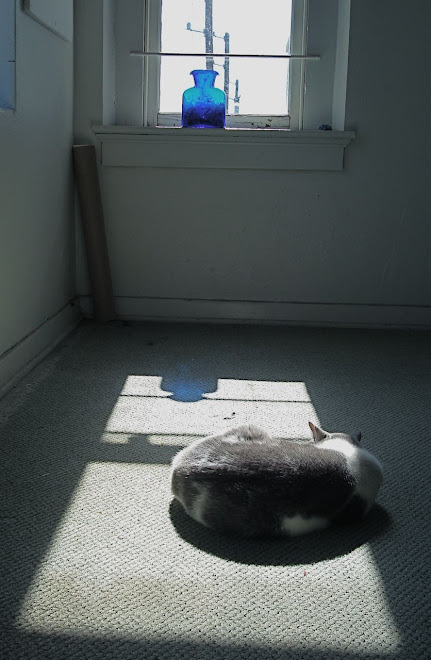
How does color set a mood? The soft gray and white of the carpet, the cat Marshall, and the sunlit window contribute to to the sense of calm repose. What does blue mean to you or me? We all have symbolic associations for colors; some based on personal experience and some instilled culturally. 

The cobalt blue of the vase provides a point and counterpoint to the composition, in addition to providing elements that balance.
Keeping the cat in the lower third of the composition weights the image and is another visual door into the picture world.

November 19, 2008

November 19, 2008

November 19, 2008

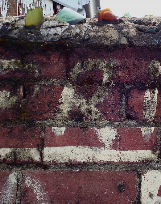
This picture tells several stories. It references the human desire to order the world around us - the lettering on the wall establishes the alley as a No Parking zone, and the broken glass-  jutting out at the top - is another message of fear and frailty. Whoever lives behind this wall wants to be left alone.

But there is beauty in the contrast of the rough brick surface and the smooth translucency of the broken glass bottles. A contrast of textures makes for an interesting composition. And the abstract nature of the printed letters against the structure of the bricks would be worth emulating in another sort of composition.

There is as much beauty in decay as there is in a bouquet of fresh flowers. And aren't decay and fresh growth just two different spots on the same continuum?


November 18, 2008

November 18, 2008

November 18, 2008

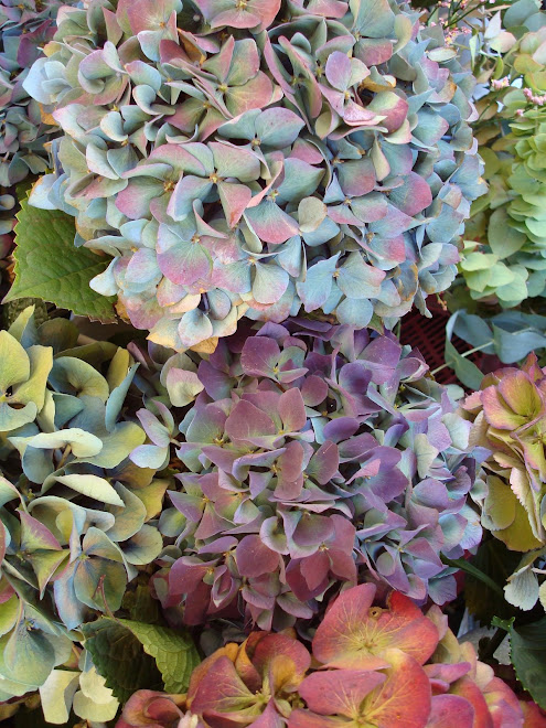
The Hydrangeas offer a lesson in the effective use of color. The pale blue and lavender are roughly the same value, so they balance each other beautifully. I am challenged to mimic that combination of analogous colors on silk Habotai!

This photograph would be considered beautiful even without the red-orange and yellow flowers at the bottom. But the addition of the complements to the blue and purple creates a focal point and generates some nice contrast because of the complementary pairing. And imagine how different this composition would be, were the red-orange and yellow at the top instead of at the bottom. The current placement adds important visual weight.

November 17, 2008

November 17, 2008

November 16, 2008

November 16, 2008
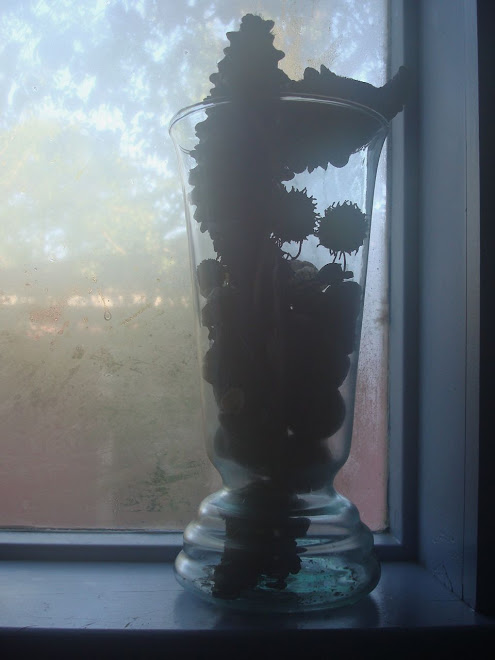
Being and Non-being

Substance and Light

November 16, 2008

We join spokes together in a wheel,
but it is the center hole
that makes the wagon move.

We shape clay into a pot,
but it is the emptiness inside 
that holds whatever we want.

We hammer wood for a house,
but it is the space inside
that holds whatever we want.

We work with being,
but non-being is what we use.

Tao te Ching; Verse 11
Stephen Mitchell translation