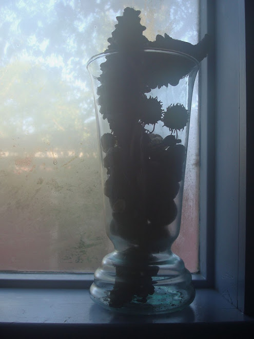
 This is a simple still life. It features an achromatic palette which means there isn't any use of chromatic (the color wheel) color. The composition is built using variations of gray, white and black, rather than spectrum colors. The color palette supports the quiet elegance of the picture.
Consider the role the lighted window on the left plays. Although it is doesn't seem to be very important at first, if you study the balance of this picture you will probably agree that the proportions of the window are almost identical to the proportions of the pitcher. In other words, if I put the pitcher inside a rectangle, the rectangle would be about the same size as the window. The two objects are in relationship with each other. The composition would feel lop-sided if the window wasn't included.
The placement of the window also shares a horizontal plane with the vase, and that builds relationship between them, too. Notice that the line up isn't exact. It's slightly staggered; making the relationship more interesting than it would be if the two objects were side by side.





1 comment:
Wonderful contrast between solid and --what would the opposite be?--muted, wispy, maybe gentle. So that contrast is primary for me, then the balance of the small window and the mass of the podium and the pitcher. I enjoy how little it takes to balance a large object. The monochromatic palette is quite soothing. Very nice again and thank you for your text as well.
Post a Comment