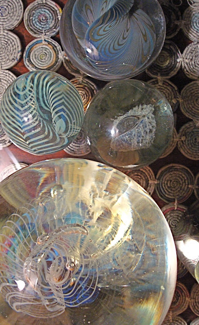
 I walk with my husband, for exercise and companionship. We were out after dark recently, and walked past an older home, on one of the side streets in the neighborhood. The bathroom light illuminated the sheer curtains and bathed the ornate perfume bottles in a soft glow. The difference between the warm, rich light and the harsh holiday lights strung up and down the block was rather jarring.
 Reviewing photos I took during December I settled on this - one of my favorites of the month. Serendipitously, it is another great example of repetition's ability to strengthen a composition.
From a design standpoint that's all well and good. What I like best about the picture is the idea/reminder that I don't have to be the brightest light on the block in order to be valuable. Hold my center, go slow, and glow! Maybe corny. Probably true.


4 comments:
Those holiday lights don't last. Just a flash in the pan and gone.
This light is soft, isn't it? Interesting to think about how to reproduce that effect with fabric. The folds of the curtains contrasted with the more severe lines of the window--repetition and contrast. A lot to see but calm. Nice!
Jackie, I always appreciate your comments. Thanks for broadening my view of the photographs by sharing your thoughts with me. It's great to know what people are thinking.
Hi Jane, I had to laugh when I read your description of the photo. My immediate reaction was what the H E double matchsticks were they doing out at night taking pics through someone's bathroom window!
I agree with Jackie's comment above - soft, inviting lights - the comfort of routine living.
Jane, So glad to find your blog...
I'll have to share this with my wife as she had (and will again when we no longer rent) a beautiful window which I installed glass shelves across for her collection of antique bottles to sit on. The site of that window when the sun was soft and low was spectacular. Equally beautiful was the play of the colored light that shone through onto many surfaces of the dining room and kitchen. Truly inspiring play of colors and shapes. We certainly hope others took pictures from the outside.
Post a Comment