Saturday, January 31, 2009

January 31, 2009

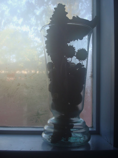
This is a simple still life. It features an achromatic palette which means there isn't any use of chromatic (the color wheel) color. The composition is built using variations of gray, white and black, rather than spectrum colors. The color palette supports the quiet elegance of the picture.

Consider the role the lighted window on the left plays. Although it is doesn't seem to be very important at first, if you study the balance of this picture you will probably agree that the proportions of the window are almost identical to the proportions of the pitcher. In other words, if I put the pitcher inside a rectangle, the rectangle would be about the same size as the window. The two objects are in relationship with each other. The composition would feel lop-sided if the window wasn't included.

The placement of the window also shares a horizontal plane with the vase, and that builds relationship between them, too. Notice that the line up isn't exact. It's slightly staggered; making the relationship more interesting than it would be if the two objects were side by side.

Friday, January 30, 2009

Thursday, January 29, 2009

Wednesday, January 28, 2009

January 28, 2009

This picture is a study in line and form. The bodies of the the flamingoes weight the composition - partly because of their size, and the fact that they fill the bottom half of the picture, and partly because of the high color contrast. Gorgeous variations of red-orange vibrate against the complementary blue green of the water in the background.

The fluid lines of the birds' necks have the potential to lead the viewer's eye up and right out of the composition. But the beaks of the birds are the visual save. Black, and curved back into the center of the picture, their form encourages our eyes to return to the composition, where we can revisit the rich color contrast and warmth of an afternoon at the zoo.

Cropping plays an important role, building relationship and interest in the picture. The original photo was much larger. The birds were only bit players in one scene from the aviary. Isolating the flamingoes, and cropping the edges of the picture close to their heads, changes their status. Now they dominate the composition. In the revised photograph the story is all about them.

Tuesday, January 27, 2009

Monday, January 26, 2009

January 26, 2009

This simple image is actually more complex than it appears to be. Light streaming through a prism on the window ledge casts a band of color onto the tile countertop. The location is right at the edge of the bathroom mirror, so we see a literal mirror image - the colors on the counter plus the colors reflected in the mirror.

I was surprised to observe that a quality I thought immutable - the order of the colors in the spectrum - was altered to generate not only color, but pattern. The small bursts of violet are in an unexpected place relative to the other  refracted colors.

We've talked about projection before. It's what the viewer brings to the picture. The message a viewer gets could be the one the artist intended to reference, but experience and belief systems influence what a viewer will see and/or think about any composition. 

This picture is a good example of one that can be appreciated for its own sake, as an abstract study of colors against a grid, but it will probably suggest spiritual content to some viewers. This is the democracy of the artful composition. We are allowed to see whatever we want!

Sunday, January 25, 2009

Saturday, January 24, 2009

January 24, 2009

Balance is developed several ways within a picture world. Locating the focal point - the spot your eye goes first - in the center of the composition, is defensible if my goal is to create a meditative piece, but it's a location that also risks being static.

Any other placement must be carefully considered. Placing an important design element too close to the edge or top of a composition leads the viewer's eyes right out of the picture. If these two gulls - mother and hungry child - were the only elements in this picture, their location so close to the right edge would be problematic! My eyes would veer to the right, encouraged by the sharp shadow point of the beaks, and might never come back to the beach.

In this picture the reflection of the humans balances the gulls. I look at the gulls, but then back to the reflections. The juxtaposition of the humans and the birds keeps my eye inside the picture world, where I can continue to look, and also reflect...

Friday, January 23, 2009

Thursday, January 22, 2009

January 22, 2009

Personal taste or preference ranges over a very broad terrain. As a younger artist, I adored images and surfaces that were maxxed out visually. I couldn't get enough color, texture and metallic leafing. 

I still love a well-crafted, intensely layered composition. But I have also come to love simplicity of form and also of surface. Perhaps this is a factor of maturity. As I study and learn, I have developed a greater appreciation for both ends of the continuum, and everything in between.

Wednesday, January 21, 2009

Tuesday, January 20, 2009

January 20, 2009

A great nation is like a great man;
When he makes a mistake, he realizes it.
Having realized it, he admits it.
Having admitted it, he corrects it.
He considers those who point out his faults
as his most benevolent teachers.
He thinks of his enemy
as the shadow he himself casts.

If a nation is centered in the Tao,
if it nourishes its own people
and doesn't meddle in the affairs of others,
it will be a great light to all nations in the world.

Tao te Ching
Verse 61
Stephen Mitchell translation

Pray for our new president.

Monday, January 19, 2009

Sunday, January 18, 2009

Tuesday, January 13, 2009

January 17, 2009

January 16, 2009


" The deepest sound is silence. This may seem paradoxical only if we regard silence as an absence of life and vibration. But for a meditator, silence is sound unified with all of its opposites. It is both sound and soundlessness, and it is in this confluence that the power of meditation emerges."

365 Tao: Daily Meditations
Deng Ming-Dao

January 15, 2009

No surface designer worth his or her salt is capable of escaping the fascination with texture... but how to capture the original texture and make it a valid visual component? The Spanish moss references the barbed wire. The soft and natural world versus the contained and hard-edged human world. What to do?

Printing is my first love, so I could interpret the lines of the Spanish Moss using India ink, or a fine line marker on paper. I could turn that line drawing into a silkscreen; one of the most versatile of printing tools. Or I could put the photograph in a drawing program, even a simple one like Powerpoint, and change it into a black and white image. The B/W picture could translate into a silkscreen, too. The barbed wire image could also be altered either of these ways.

I call the introduction of an image onto a surface using printing a faux texture. Faux means false in French, and we're all familiar with faux painting - an artist's rendition of a scene so that it looks real - a window, with landscape beyond - painted on a building, for example. Faux texture is essentially the same thing. The printed image references the real texture, but is a flat representation of it.

Three dimensional work could also be introduced to mimic the original Spanish Moss and barbed wire. Needle felting is a fantastic means of applying loose, thready stuff onto a flat surface. Hand or machine embroidery? More intriguing choices.

For me, it always comes down to the most elegant choice. The application that rises to the top during my intentional consideration of the possibilities. It takes time to figure out what the most elegant choice is. But it's always worth it.


January 14, 2009

Oh happy day....That's what I think when I drive past this building. The graffiti is playful, and although NOT spontaneous - is driven by some spontaneous spark. I wish I knew the artist - so I could give credit where credit is due. Don't you think sometimes art that feels gorgeous and hopeful is worth the price of admission?

January 13, 2009

Monday, January 12, 2009

Sunday, January 11, 2009

January 11, 2009

This is interesting. My eye goes first to the clock, so that makes it the focal point. But it happens to be in an unorthodox location as focal points go - in the upper third of the picture and very close to the edge of the frame. Why doesn't it lead my eye out of the photo? Why do I have a sense of it being balanced, despite its location?

I think the round shape of the clock plays a key role. It leads my eye around and around, rather than out. And the hands on the clock are also an important visual cue. The long hand points down and back into the middle of the photo, where I am then engaged by the busy lights, and the mirror and the waitress. The stainless steel vent and coffee urns lend visual weight to the photo and balance the clock. Their placement also encourages the viewer's eye to stay inside the frame, where there is still more to see.

And by the way, it's always Christmas at Mi Tierra!

Saturday, January 10, 2009

Friday, January 9, 2009

Thursday, January 8, 2009

Wednesday, January 7, 2009

Tuesday, January 6, 2009

January 6, 2009

I walk with my husband, for exercise and companionship. We were out after dark recently, and walked past an older home, on one of the side streets in the neighborhood. The bathroom light illuminated the sheer curtains and bathed the ornate perfume bottles in a soft glow. The difference between the warm, rich light and the harsh holiday lights strung up and down the block was rather jarring. 

Reviewing photos I took during December I settled on this - one of my favorites of the month. Serendipitously, it is another great example of repetition's ability to strengthen a composition. 

From a design standpoint that's all well and good. What I like best about the picture is the idea/reminder that I don't have to be the brightest light on the block in order to be valuable. Hold my center, go slow, and glow! Maybe corny. Probably true.

Monday, January 5, 2009

Sunday, January 4, 2009

January 4, 2009


I couldn't decide which image I like best, so I am posting all three. These pictures are interesting variations on the use of repetition. The mannequins are the focal point of each story, and the fact that there are several of them is key. Grouping the mannequins gives them visual weight. The bars of the thrift store door also contribute a repeating element. What role does it play when you study the photographs that include it?

The pictures tell different stories, based on the juxtaposition of the key elements - the mannequins - and the stories are influenced by the other design elements in each image. The misted windows and soft colors suggest one atmosphere, which is quite different from the clarity and harder edges in the other two photos. I find the projection part of the equation fascinating. My mind automatically begins to develop a story line when I study the pictures. I don't even have to do it intentionally.

The top photo feels poignant, maybe trapped. The middle image doesn't have as much emotional content for me. I see it as an abstraction - primarily form. The bottom image feels inviting in a funny way. Are the headless bodies inviting me in? Is this some weird scene from a horror film? Or just a friendly invitation to take a look around?

Saturday, January 3, 2009

January 3, 2009

Do Not Burn Near Combustibles.
Those are the words embossed on the votive candles at San Fernando Cathedral.

Repetition is a design term, and refers to the use of an element more than once in a composition. Including an element multiple times in a picture serves several purposes. 

The artist's intent could be to generate balance among design elements. The use of repetition could also be a visual clue from the artist, indicating the importance of an element to the composition's story line. Grouping like elements sends a message that is quite different from the use of an element all by itself, at least partly because sheer numbers generate a visual impact more powerful than the use of a single element. Imagine how different this picture would be if only one candle glowed in the dark. Perhaps then it would read visually as a beacon. Or a single prayer or wish. 

The use of repetition in this picture supports a different message. It suggests hundreds of prayers being offered simultaneously. Each one unique and important, but each made more powerful as part of the collective offering. 

Friday, January 2, 2009

January 2, 2009

A study in texture and form. The subtle cream and gray tones play a supporting role in the development of the visual story, but the lead players are definitely the abstract form the bones create, and the texture generated by the massing of the elements.

Thursday, January 1, 2009

November 20, 2008

November 20, 2008

November 20, 2008

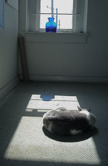
How does color set a mood? The soft gray and white of the carpet, the cat Marshall, and the sunlit window contribute to to the sense of calm repose. What does blue mean to you or me? We all have symbolic associations for colors; some based on personal experience and some instilled culturally. 

The cobalt blue of the vase provides a point and counterpoint to the composition, in addition to providing elements that balance.
Keeping the cat in the lower third of the composition weights the image and is another visual door into the picture world.

November 19, 2008

November 19, 2008

November 19, 2008

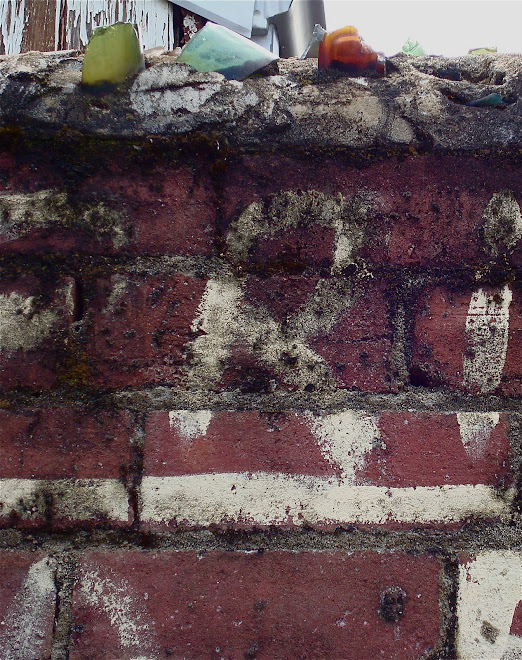
This picture tells several stories. It references the human desire to order the world around us - the lettering on the wall establishes the alley as a No Parking zone, and the broken glass-  jutting out at the top - is another message of fear and frailty. Whoever lives behind this wall wants to be left alone.

But there is beauty in the contrast of the rough brick surface and the smooth translucency of the broken glass bottles. A contrast of textures makes for an interesting composition. And the abstract nature of the printed letters against the structure of the bricks would be worth emulating in another sort of composition.

There is as much beauty in decay as there is in a bouquet of fresh flowers. And aren't decay and fresh growth just two different spots on the same continuum?


November 18, 2008

November 18, 2008

November 18, 2008

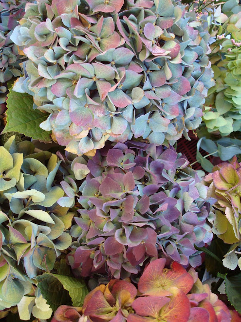
The Hydrangeas offer a lesson in the effective use of color. The pale blue and lavender are roughly the same value, so they balance each other beautifully. I am challenged to mimic that combination of analogous colors on silk Habotai!

This photograph would be considered beautiful even without the red-orange and yellow flowers at the bottom. But the addition of the complements to the blue and purple creates a focal point and generates some nice contrast because of the complementary pairing. And imagine how different this composition would be, were the red-orange and yellow at the top instead of at the bottom. The current placement adds important visual weight.

November 17, 2008

November 17, 2008

November 16, 2008

November 16, 2008
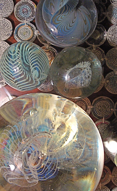
Being and Non-being

Substance and Light

November 16, 2008

We join spokes together in a wheel,
but it is the center hole
that makes the wagon move.

We shape clay into a pot,
but it is the emptiness inside 
that holds whatever we want.

We hammer wood for a house,
but it is the space inside
that holds whatever we want.

We work with being,
but non-being is what we use.

Tao te Ching; Verse 11
Stephen Mitchell translation