 The traditional green and red colors we associate with the Christmas holiday season are my least favorite colors. Having written this, I wonder how can anyone dislike a color? Colors, like flowers, just are. Does anyone ever think I don't like the sun or The moon really bothers me.? How peculiar we are, to form preferences for colors and flowers and other elements of the natural world. Human beings love to form opinions.
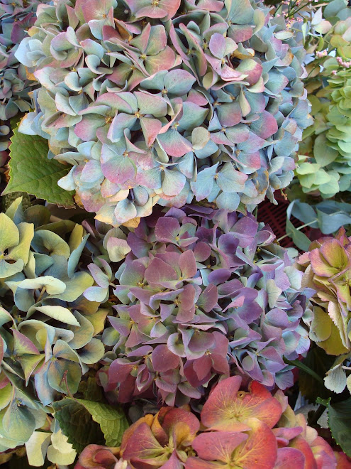
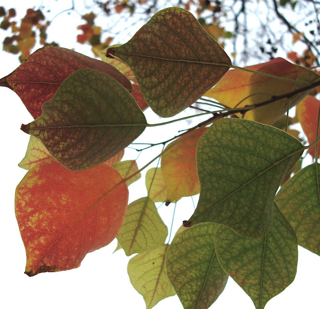
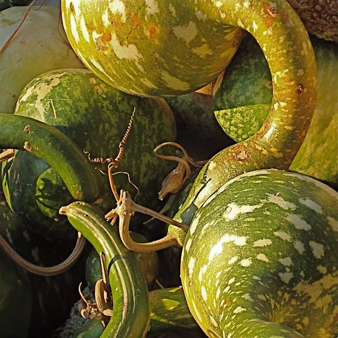
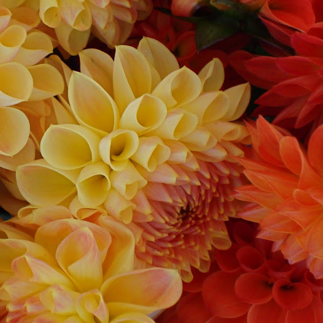
So red/green is my least favorite complementary color combination. Acknowledging my prejudice has challenged me to spend a few days studying red and green combinations that work. If I can photograph some images I like, maybe my appreciation will shift.
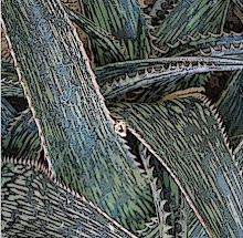
This image doesn't include red, but the green is a good start. This monochromatic study features a gorgeous range of green colors, supported by interesting lines - the contrast of the straight veins in the leaves, with the undulating edge of the individual leaves. I'd love to see it interpreted in cloth.


2 comments:
Dear Jane,
I just found your blog--what a delight! The shapes and colors and lines and.. and..and.. There's so much to see in this incredible world. I am sometimes overwhelmed by the vastness, but your focus on smaller bits suits me very well. I'll be checking in every day. Thanks for the great shots!
You are very welcome. Thanks for the input, Jackie.
Post a Comment