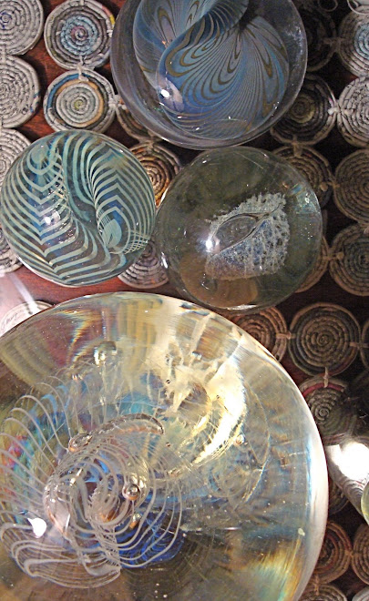
 Another photograph that would make a good simplification/abstraction study of form. The most important forms are the two purple bottles, the turquoise bottle, and the negative space on the left that curves around to the top right. The two purple bottles are the same shape, so repetition supports relationship in the composition.
Reduced to the four basic forms we see here, the new picture might not be very interesting. It would be well balanced, as the bottom-heavy shape of the purple bottles provides visual weight. But without the beautiful translucence of the glass and the subtle color variations, the interest generated by the image would be minimal.
That's one challenge of abstracting and/or simplifying a composition. How could color and texture be re-introduced, in order to keep the image one worth studying?


1 comment:
Indeed, some images are more graphic than others, translate more easily into shapes. The one yesterday of the railing was definitely a graphic design but it wasn't the design that was interesting, at least not all together. The glass has a dimension that isn't easily captured by a line either. My list says "line, shape, value, color, texture." (don't know where I got the list either, but I like it.) I guess we need them all, all the time, don't we? Goodness, it isn't easy, is it? But what fun, what joy! Thank you for planting so many seeds of wonder in my brain!
Post a Comment