
Friday, March 6, 2009
Subscribe to:
Post Comments (Atom)
November 20, 2008
November 20, 2008
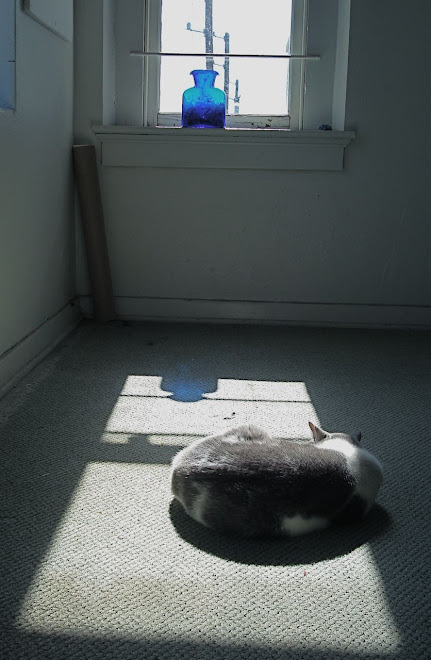
How does color set a mood? The soft gray and white of the carpet, the cat Marshall, and the sunlit window contribute to to the sense of calm repose. What does blue mean to you or me? We all have symbolic associations for colors; some based on personal experience and some instilled culturally.
The cobalt blue of the vase provides a point and counterpoint to the composition, in addition to providing elements that balance.
Keeping the cat in the lower third of the composition weights the image and is another visual door into the picture world.
November 19, 2008
November 19, 2008
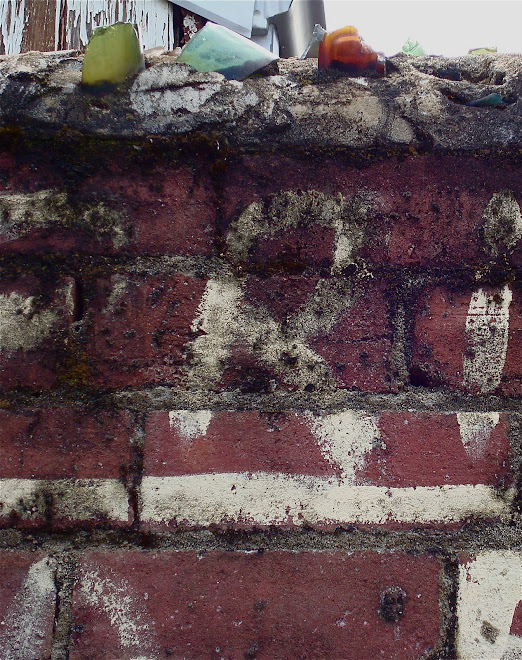
This picture tells several stories. It references the human desire to order the world around us - the lettering on the wall establishes the alley as a No Parking zone, and the broken glass- jutting out at the top - is another message of fear and frailty. Whoever lives behind this wall wants to be left alone.
But there is beauty in the contrast of the rough brick surface and the smooth translucency of the broken glass bottles. A contrast of textures makes for an interesting composition. And the abstract nature of the printed letters against the structure of the bricks would be worth emulating in another sort of composition.
November 18, 2008
November 18, 2008
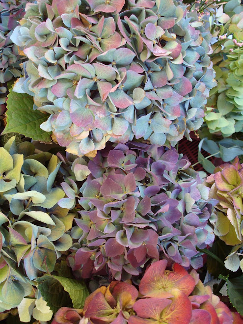
The Hydrangeas offer a lesson in the effective use of color. The pale blue and lavender are roughly the same value, so they balance each other beautifully. I am challenged to mimic that combination of analogous colors on silk Habotai!
This photograph would be considered beautiful even without the red-orange and yellow flowers at the bottom. But the addition of the complements to the blue and purple creates a focal point and generates some nice contrast because of the complementary pairing. And imagine how different this composition would be, were the red-orange and yellow at the top instead of at the bottom. The current placement adds important visual weight.
November 17, 2008
November 16, 2008
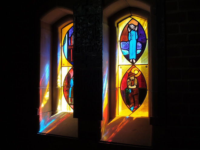
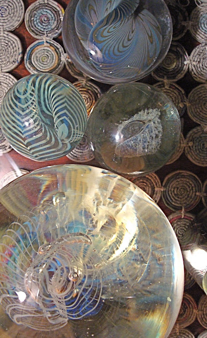
Being and Non-being

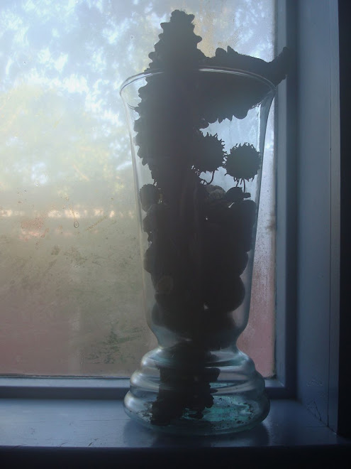
Substance and Light
November 16, 2008
We join spokes together in a wheel,
but it is the center hole
that makes the wagon move.
We shape clay into a pot,
but it is the emptiness inside
that holds whatever we want.
We hammer wood for a house,
but it is the space inside
that holds whatever we want.
We work with being,
but non-being is what we use.
Tao te Ching; Verse 11
Stephen Mitchell translation


3 comments:
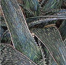
I want to insert an eye in there and turn the image into a bird looking over its shoulder, but perhaps that would be too literal. I wonder if you look at your images and contemplate how you would translate them into fibres, feathers, etc. Or are you happy to leave them complete in themselves. I find as an artist that one thing inevitably leads to another...
Lovely shapes and colors, very rich hues. Nice range of values too and light! Interesting negative spaces. The cropping really emphasizes the lines and shapes of the plant. The 'beak' pointing right dominates but not totally, the eye keeps moving to the pod and the draped 'leaves' on the left. Very interesting. Thank you.
To my eye(s) -- old eyes to be sure -- this looks like a photograph of a painting...there are "brush strokes" everywhere, even the woodwork in the background. Very interesting...
Post a Comment